UX Writing and Design: Improve Conversion Rate
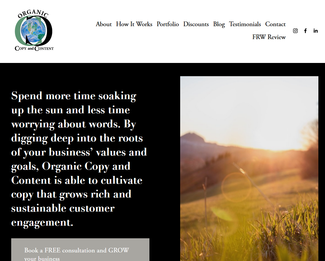
A copywriter was having a hard time landing clients using her Squarespace website. I offered to rewrite the UX writing of her site and update the design of the content. On her original design, the first thing I noticed upon loading her page, was the cramped text of a very long headline and an image of a sunny meadow. The cramped text of the headline created too much cognitive work for me to get a solid first impression of what her business was and what it was offering. Here is the original page.
Using words from her original copy, I simplified the hero and her CTA. The sunny meadow image was traded out for a solid color background that matched the brand colors in her logo. I condensed the navigation bar at the top and made sure it was responsive for smaller screens. Here is the redesign.
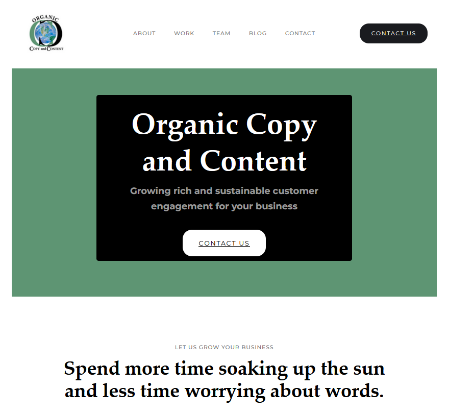
With this new improved hero, it was clear what her business name was and what they did. Below the hero, I added a client benefit of using her service. The word clutter was gone.
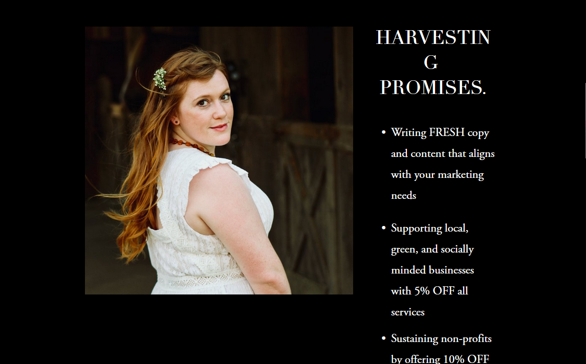
On her original site, below the hero she had this page.
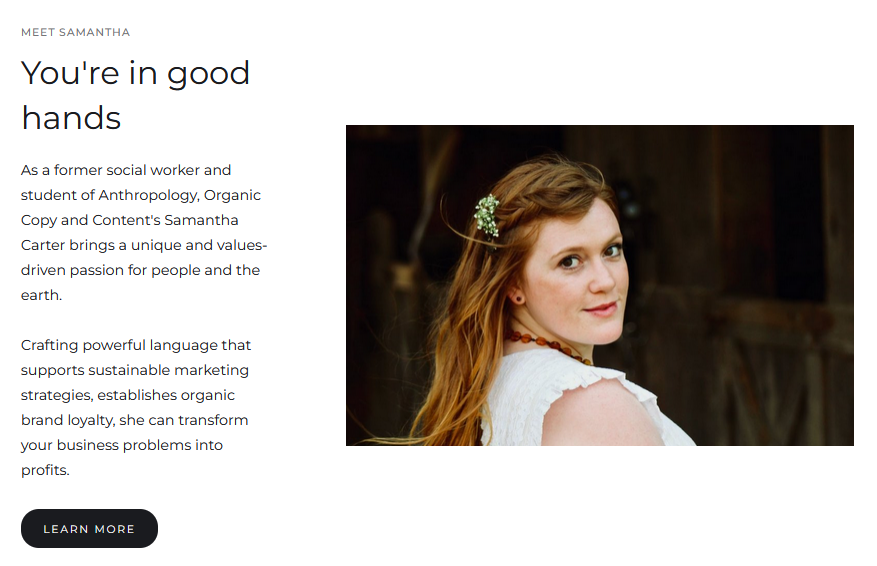
I rewrote this part of the page to instead focus on her talents and the value she would bring to a client. Here is the rewrite below.
Under this bio picture, she had this piece of copy.
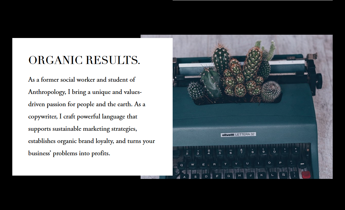
As you can see, I moved this copy to use in the section with her bio picture. It made a stronger impact to place copy about her talents next to her face instead of a stock photo of a typewriter. I also thought that the image of cactus emerging from the typewriter could give off the wrong impression that her words were harsh and "prickly." In place of this section, I rewrote the section to look like this one below.
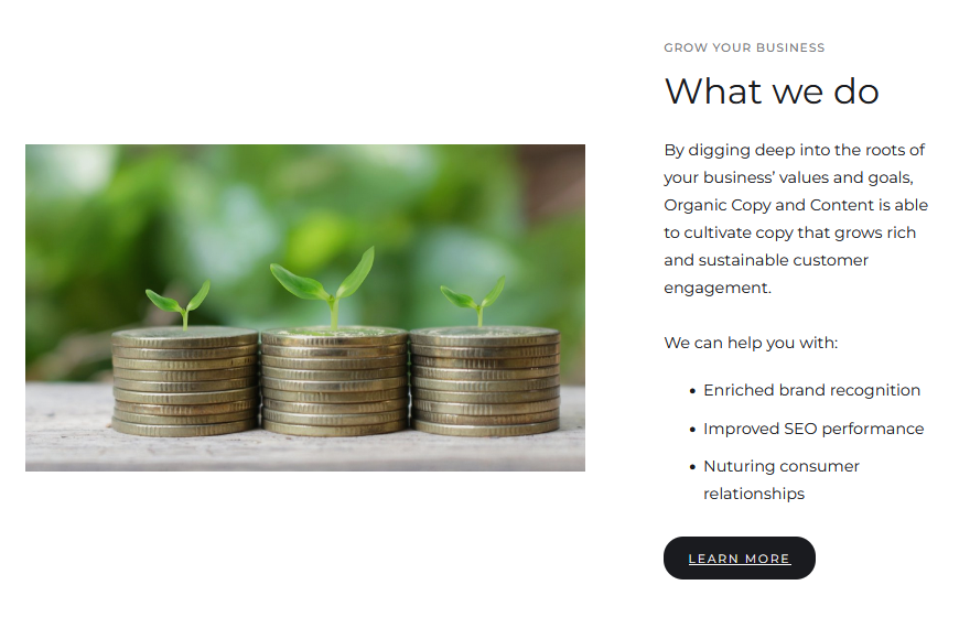
I led the design with an emphasis on what she would deliver to a client and how they would benefit from her work.
Finally, I took a look at the footer on her homepage. Here is the original footer.
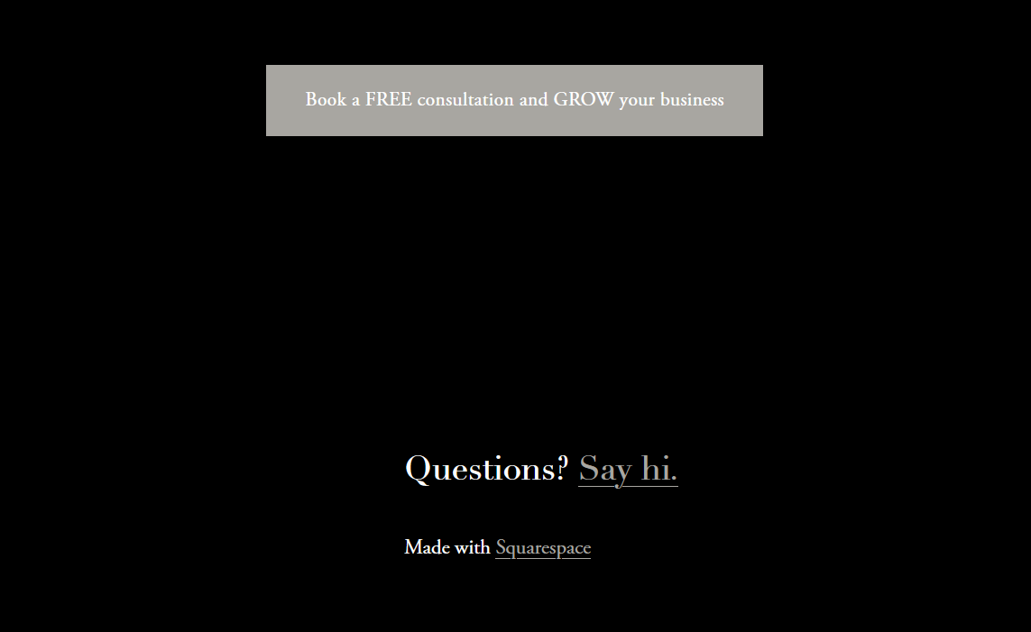
The excessive amount of dark space makes this section feel uninviting and unfinished. I redesigned the footer to look like this instead.

Using her original motto of "Grow your business" I made the footer a clear and strong CTA instead of a request for questions.
Overall, this rewrite and redesign does a much better job of getting right to the point of what she does and what she offers. The copy is given more room to breathe and eases the users cognitive load compared to the original design.
The next step would be collecting data on how this rewrite increased her success rate with booking new clients.
Post a comment